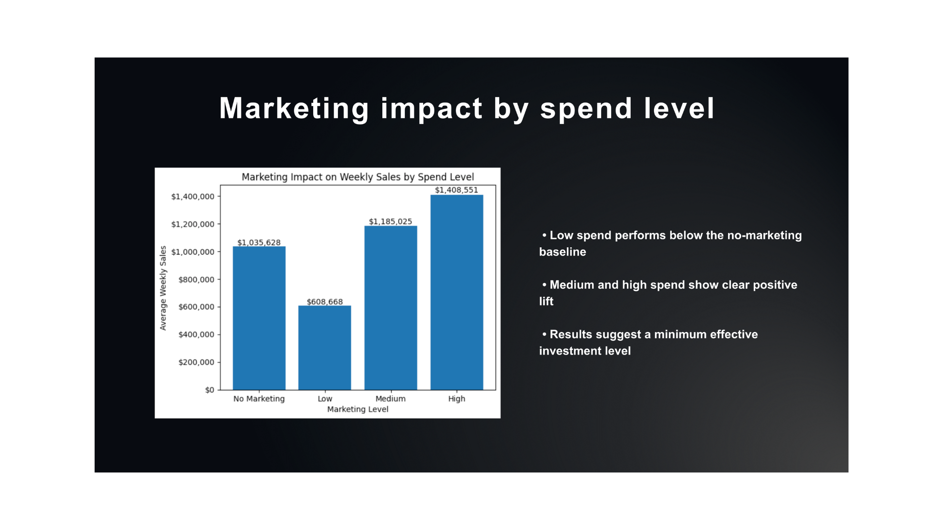
Marketing Performance by Spend Tier
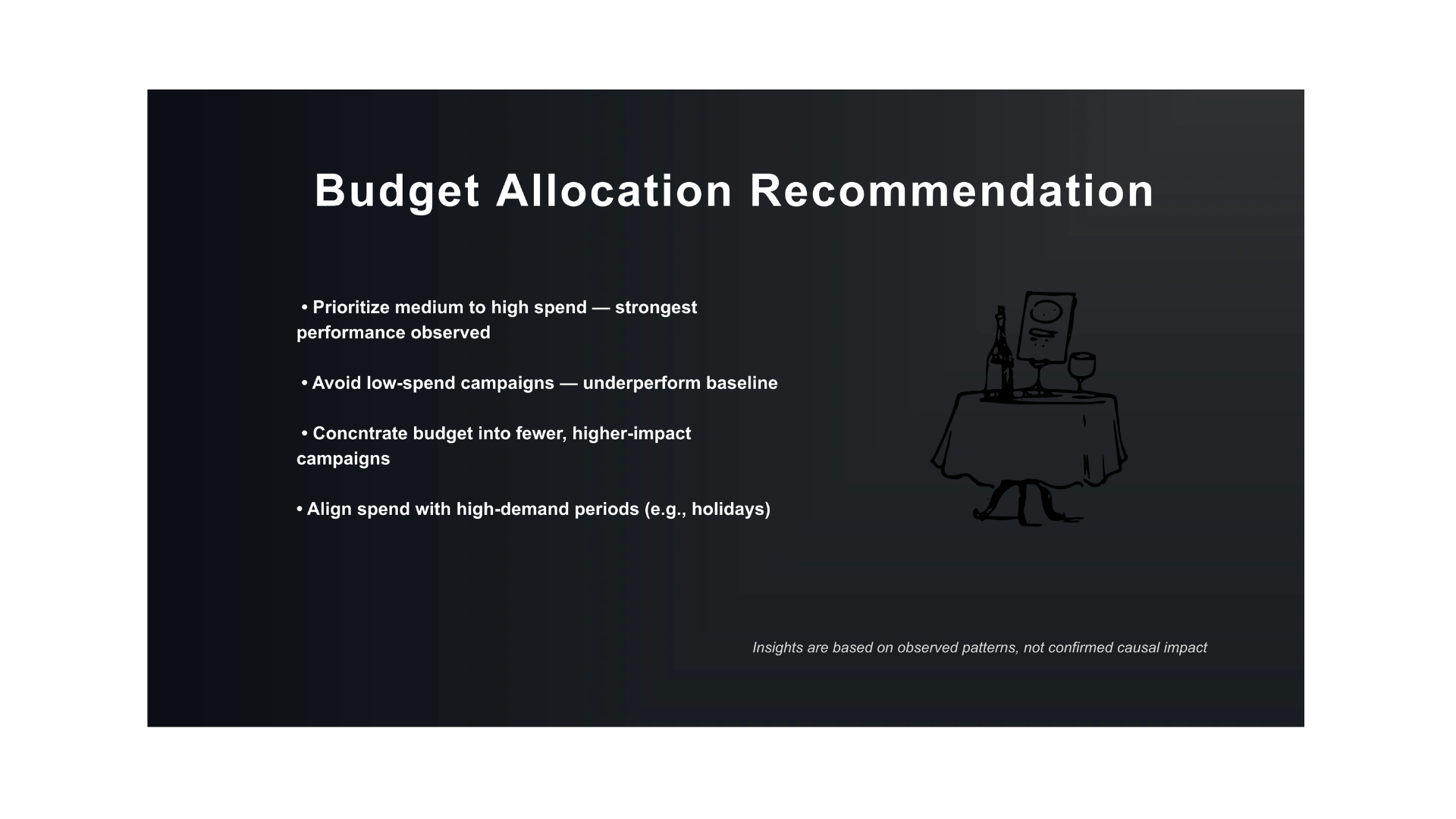
Recommended budget strategy — focusing investment where marketing drives measurable impact
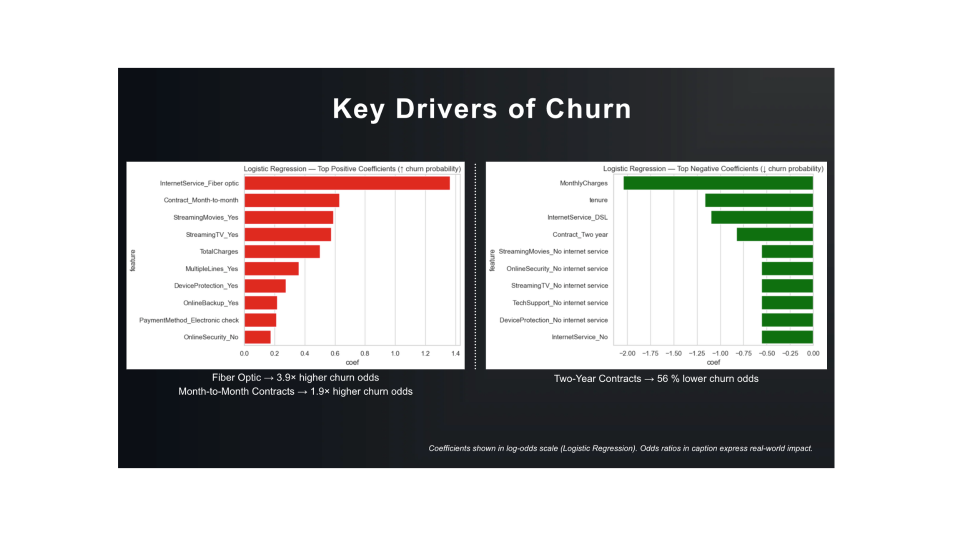
Key Drivers of Churn — Translating Model Coefficients into Actionable Insights
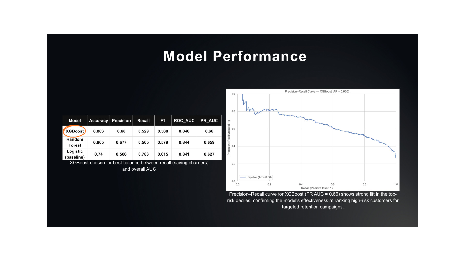
Model Performance — Comparing models to identify the strongest classifier for targeted churn-reducti
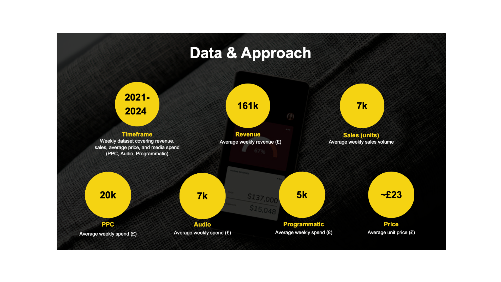
Dataset Summary — Inputs for Media Mix Modeling
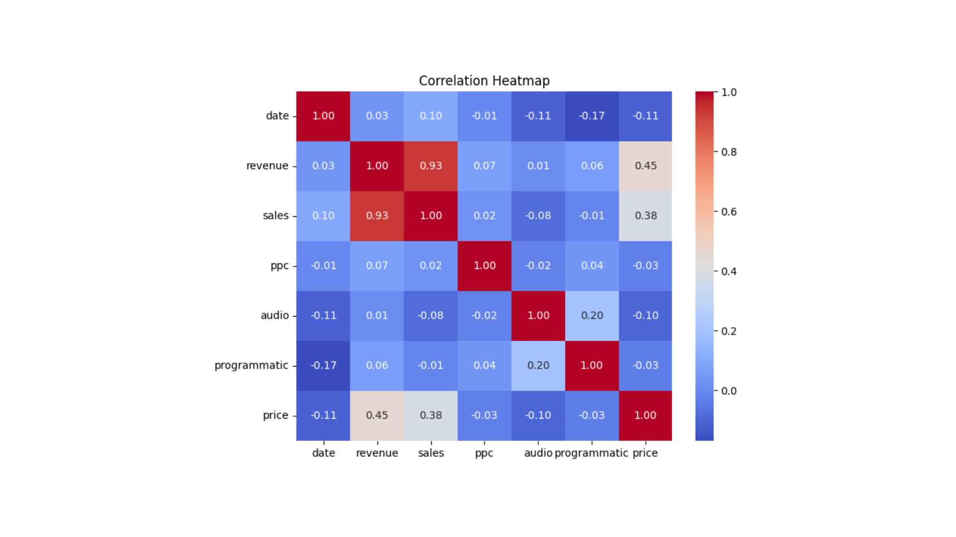
Media Channels vs. Revenue — Correlation Overview
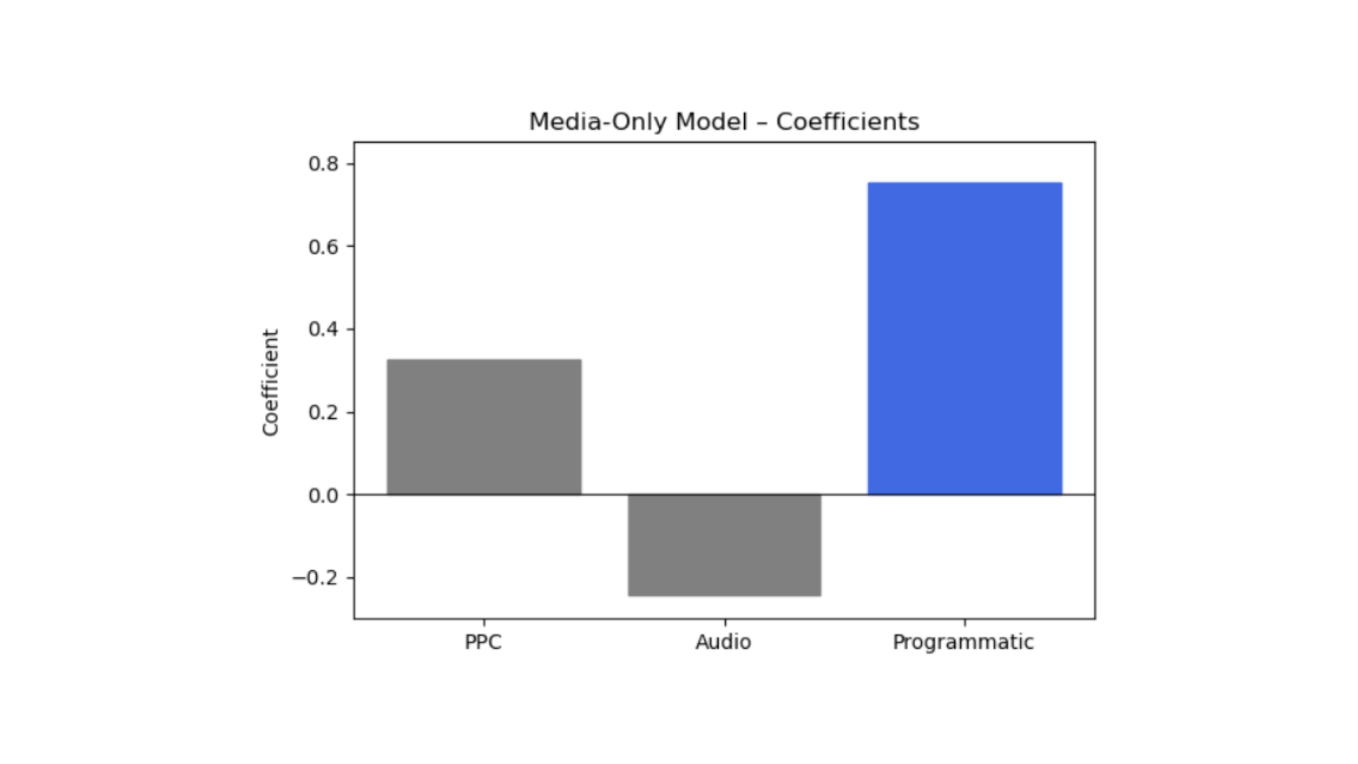
Channel impact on revenue — identifying where marketing spend drives the most value

Experiment design — testing causal impact before scaling budget decisions
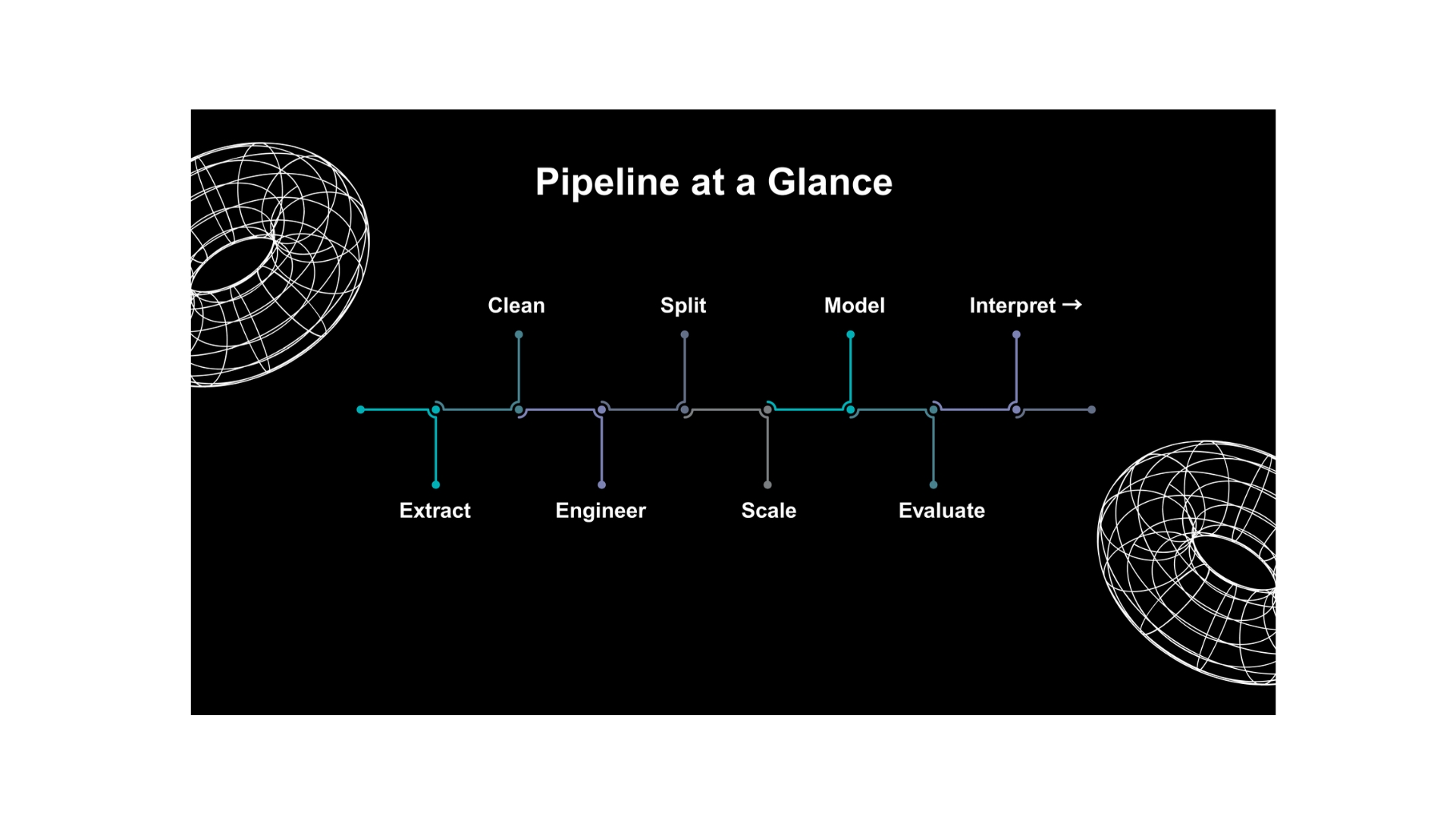
Pipeline at a Glance — High-level workflow for building the Spotify popularity model.
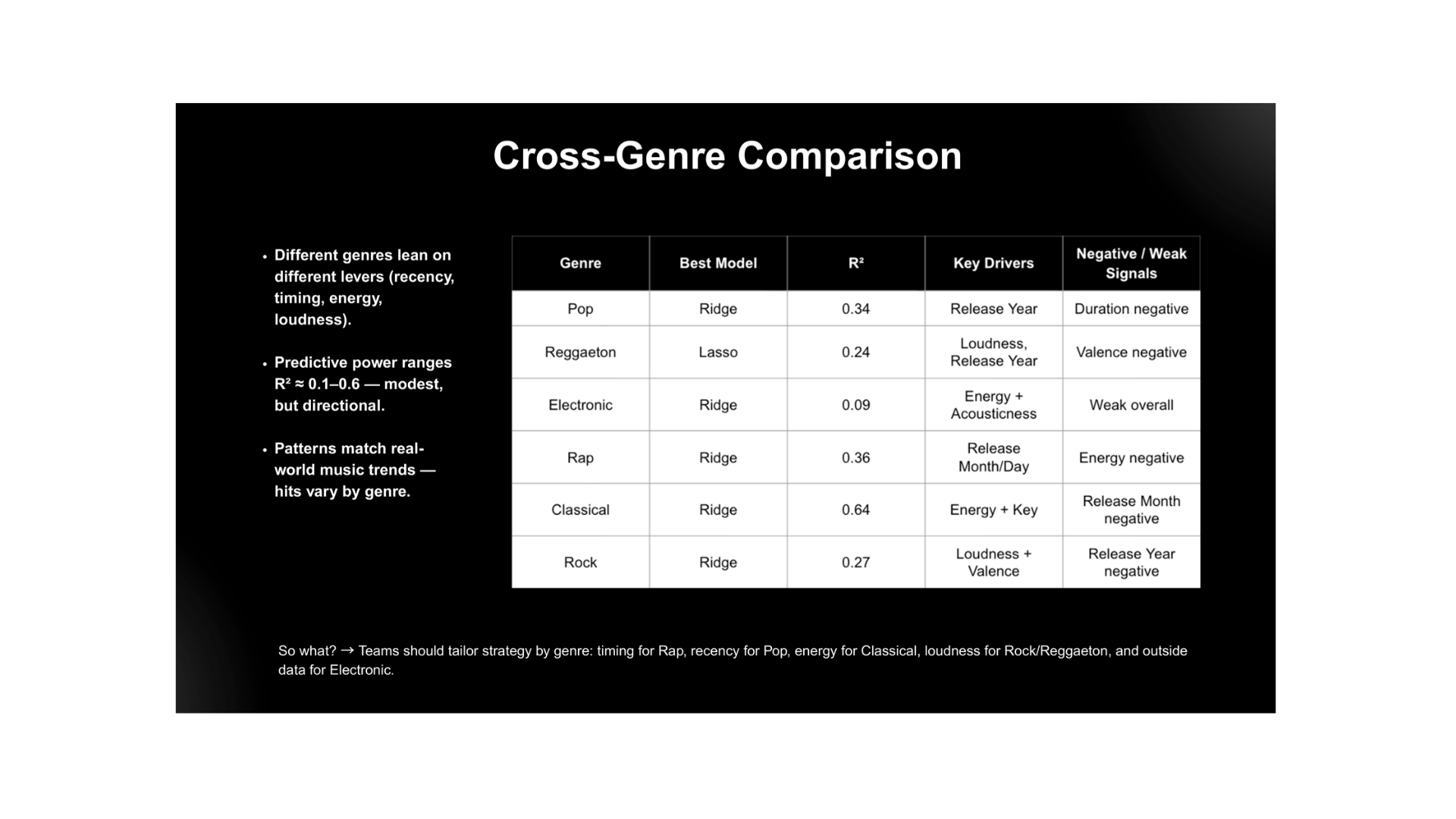
Cross-Genre Comparison — How predictive signals and key audio drivers vary by genre.

Luxury Fashion Sales Trends — Seasonal Demand Insights

Luxury Fashion Payments — Cash vs. Card Trends
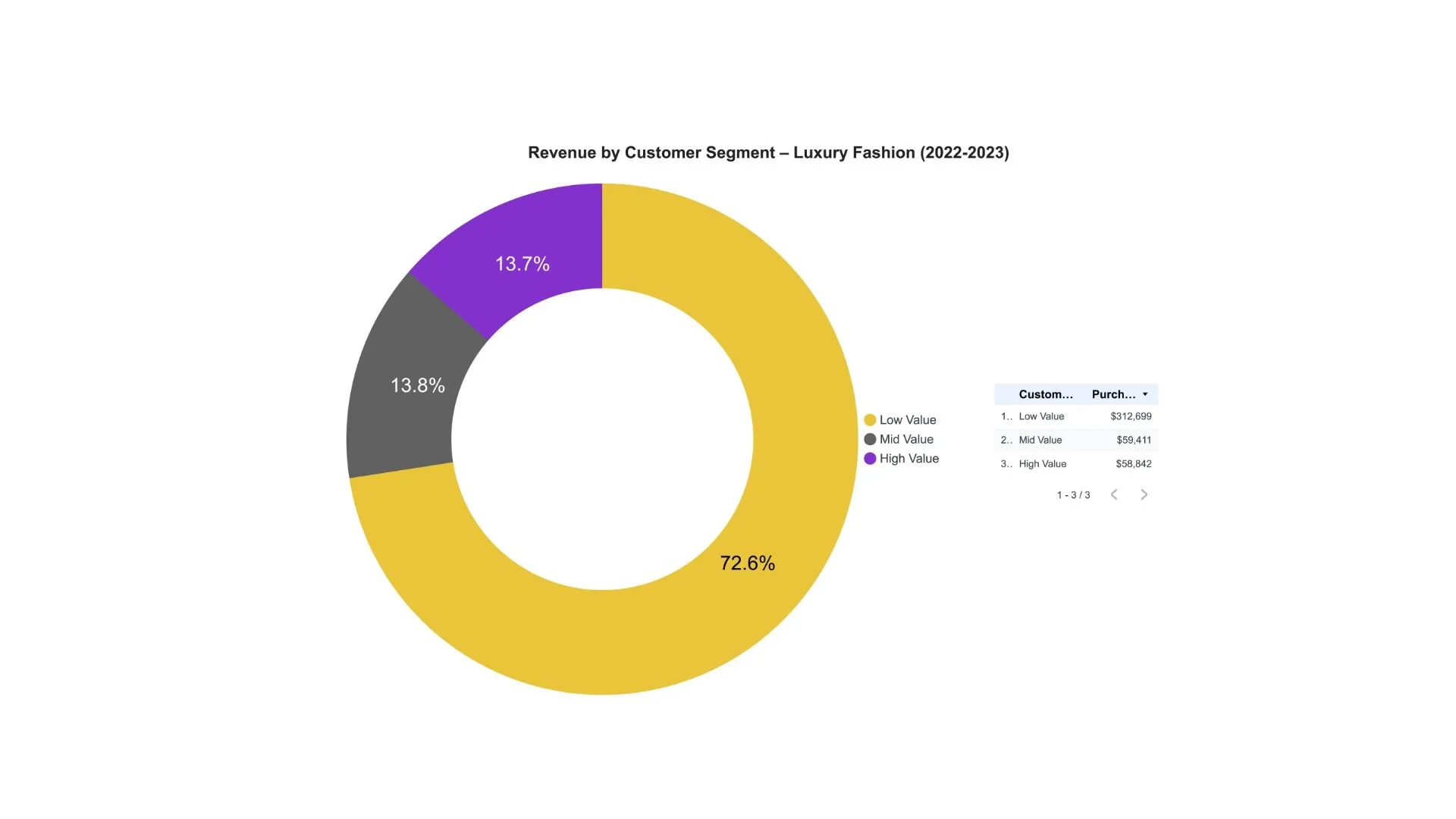
Customer Segmentation — Revenue Contribution by Value Tier

Customer Value Segments — Revenue Share Breakdown
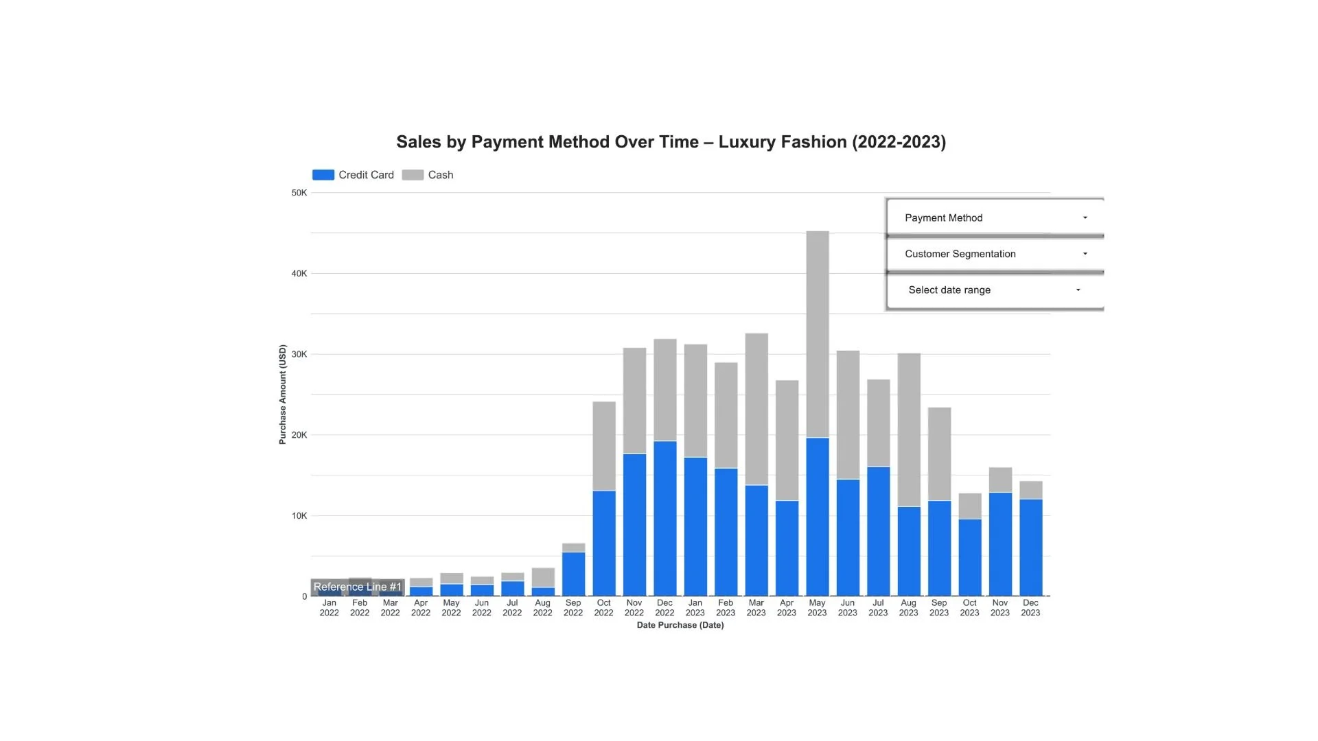
Payment Method Mix — Month-to-Month Sales Breakdown

Payment Method Mix — Monthly Luxury Sales Comparison

Manhattan Contracts Signed — Year-Over-Year Trend (2024 vs. 2025)
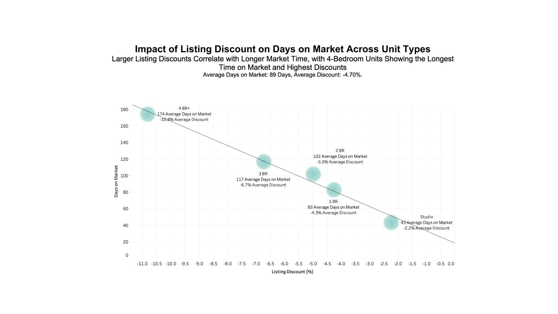
Listing Discounts vs. Days on Market — Trends by Unit Type

Contract Activity Heatmap — Manhattan Neighborhoods (2020–2024)

Signed Contract Activity — Busiest Months (2020–2024)

Manhattan Contracts Signed — Multi-Year Market Trends (2020–2024)

Manhattan Contracts Signed — Multi-Year Seasonal Patterns (2020–2024)

Rental Prices vs. Days on Market — Neighborhood Comparison

Median Rents vs. Days on Market — Neighborhood Comparison

Average Manhattan Rents — Unit Type by Neighborhood

Median Manhattan Rents — Unit Type by Neighborhood

Asking Price Distribution — Outlier Detection

Asking Price Distribution — Zoomed-In Outlier View

Average Listing Prices — Top Manhattan Neighborhoods (Sept 2024)

Price per Sq Ft — Top Manhattan Neighborhoods (Sept 2024)

Data Snippet and Visualization of Features Before Modeling

Average Popularity of Pop Artists in the Dataset, Obtained Directly via Spotify API

Popularity Scores — Distribution by Artist

Valence Levels — Distribution by Artist
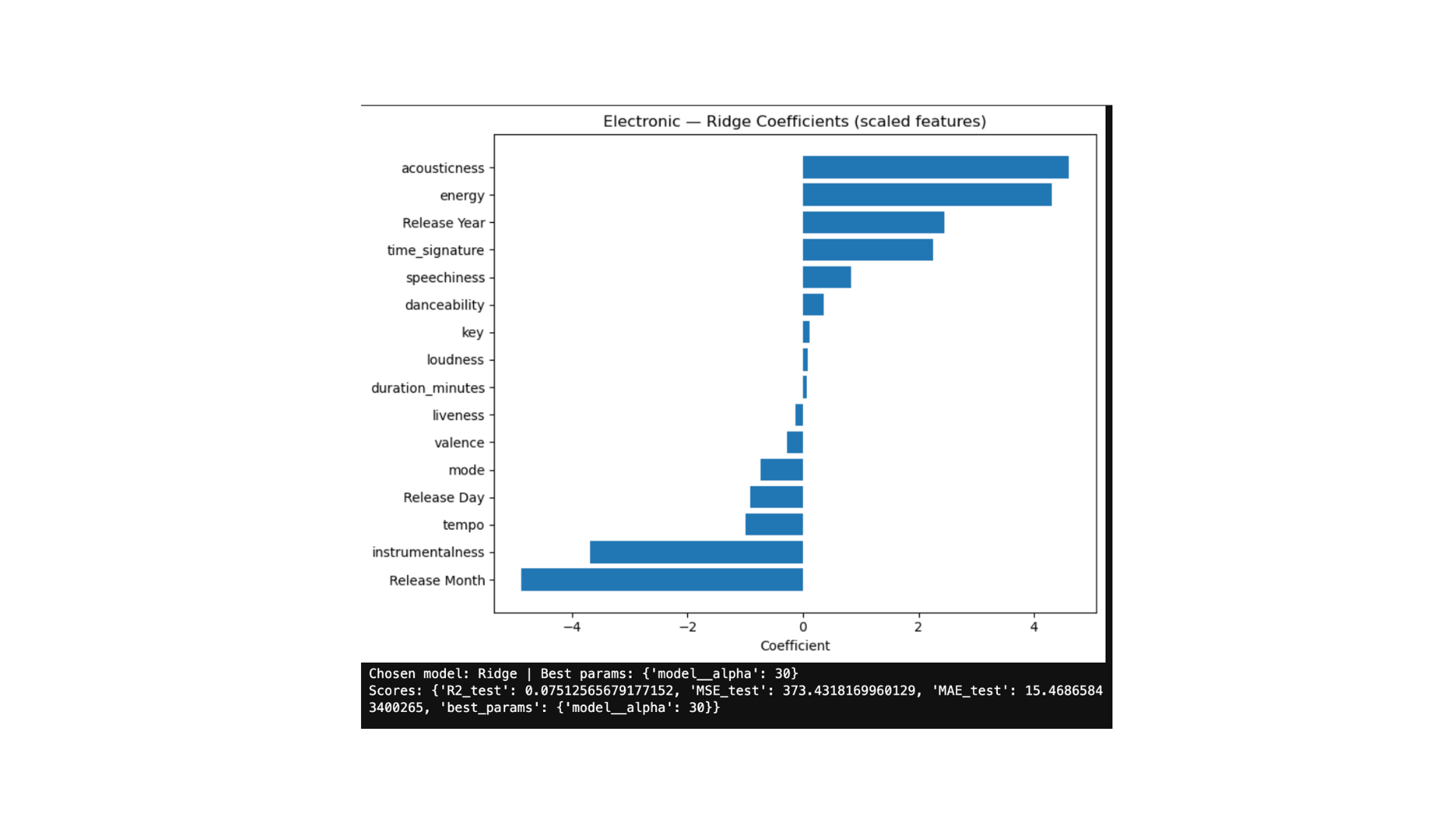
Electronic — Energy and acousticness most strongly predict popularity
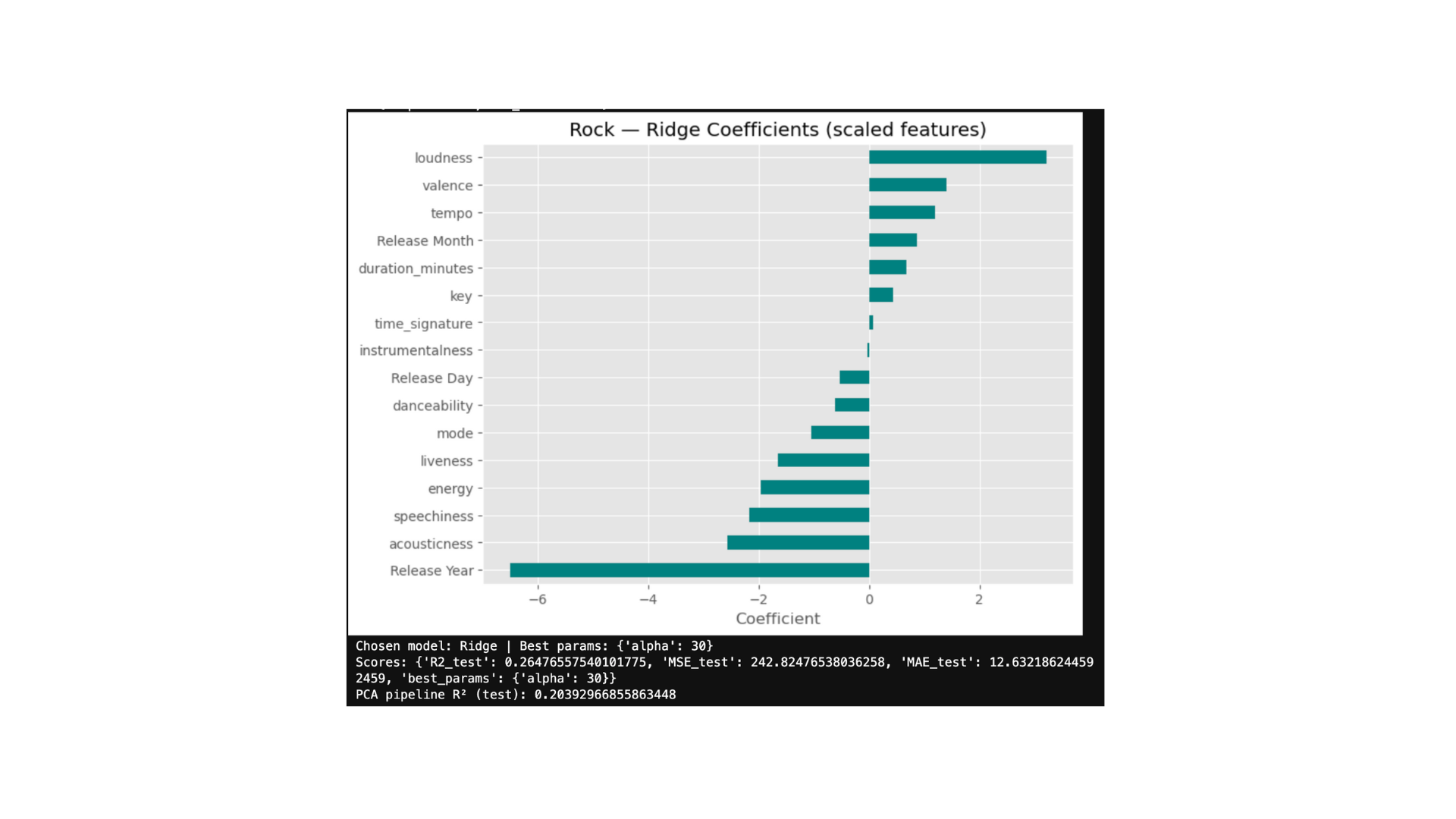
Rock — Loudness and recency are the dominant predictors.

Correlation of Numeric Columns in Hotel Review Sentiment Analysis Project

Confusion Matrix: Visualizing Model Performance in Hotel Review Sentiment Analysis

Natural Language Processing: Top Coefficient Indicating Positive Sentiment in Hotel Reviews

Natural Language Processing: Lowest Coefficient Indicating Negative Sentiment in Hotel Reviews

US Heat Map: States with the Most Flight Departure Delays on Aviation Project

Aviation Project: Top Airports with the Most Flights by Airline

Statistics and Public Health: Prevalence of West Nile Virus by Mosquito Species

WNV Presence in Mosquitoes (2008-2020): Higher Mosquito Counts Don't Indicate More WNV

Linear Regression: Visualizing the Line of Best Fit with Seaborn

Distribution in Statistics: The Bell Curve for Height and Weight Data, created with Seaborn

Analyzing Time Spent on Website by a Group of Visitors
